Adrian Frutiger facts for kids
Quick facts for kids
Adrian Frutiger
|
|
|---|---|
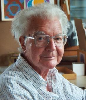
Frutiger in 2002
|
|
| Born | 24 May 1928 Unterseen, Switzerland
|
| Died | 10 September 2015 (aged 87) Bremgarten bei Bern, Switzerland
|
| Alma mater | Kunstgewerbeschule Zürich |
| Occupation | Typographer & designer |
|
Notable work
|
Univers, Frutiger and Avenir |
| Spouse(s) |
Paulette Flückiger
(m. 1952; died 1954)Simone Bickel
(m. 1955) |
| Children | 3 |
Adrian Johann Frutiger (born May 24, 1928 – died September 10, 2015) was a famous Swiss typeface designer. He changed how typefaces were designed in the second half of the 20th century. His work covered different printing methods, from old-style metal printing to modern digital fonts. He lived in Bremgarten bei Bern, Switzerland, until he passed away.
Frutiger's most well-known designs are Univers, Frutiger, and Avenir. These are all sans-serif typefaces, which means they don't have the small lines (serifs) at the ends of letters. Univers was special because it was one of the first sans-serif fonts to have many different styles, like various widths and weights. Frutiger said that creating sans-serif fonts was his "main life's work." He found it challenging but rewarding.
Contents
Early Life and Education
Adrian Frutiger was born in Unterseen, Switzerland. His father was a weaver. As a boy, Adrian loved to create his own unique writing styles. He didn't like the strict, formal handwriting taught in Swiss schools. His parents and teachers encouraged him to learn a trade instead of just focusing on art. He first thought about becoming a pastry chef. But then, he got an apprenticeship at a printing house in Interlaken.
At 16, he started a four-year apprenticeship as a compositor (someone who sets type for printing). He worked at the Otto Schlaeffli printing house. During this time, he also took classes in woodcuts and drawing in Bern. Later, he worked as a compositor in Zürich. In 1949, he went to the Kunstgewerbeschule Zürich (a design school). There, he studied calligraphy, which is the art of beautiful handwriting. He also started sketching ideas for what would become his famous Univers typeface.
Personal Life and Legacy
Adrian Frutiger married Paulette Flückiger in 1952. She sadly passed away in 1954 after their son was born. In 1955, he married Simone Bickel. They had two daughters who faced health challenges and passed away young. Because of this, Frutiger and his wife started the Fondation Adrian et Simone Frutiger. This foundation helps fund research in psychology and brain science. It also supports better mental health care.
Frutiger spent most of his career in Paris, France. He moved back to Switzerland later in his life. He described himself as a Calvinist, which is a type of Protestant Christian faith.
Designing Typefaces
Adrian Frutiger was hired by a famous printing company in Paris called Deberny et Peignot. They were impressed by his detailed essay about how European letters developed. At this company, Frutiger designed his first typefaces. These included Président, Méridien, and Ondine. He also helped change existing typefaces for new photo-typesetting machines.
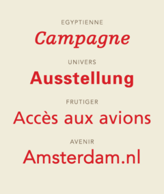
His first font for sale was Président in 1954. It was a set of capital letters with small, decorative lines. Ondine, a flowing, informal script font, also came out in 1954. In 1955, he released Méridien, a classic-looking font with serifs. This font showed his ideas about how letters should be built and look unified. Frutiger often used narrow, wedge-shaped serifs in his designs. In 1956, he designed Egyptienne, a slab serif font (with thick, block-like serifs).
Univers: A Big Family of Fonts
The head of Deberny et Peignot wanted a large, connected font family. He wanted it to work for both old metal printing and new photo-composition. Frutiger didn't like the very strict look of some popular fonts at the time. He convinced his boss that the new font should be based on a more natural, "neo-grotesque" style. The Akzidenz-Grotesk font from 1898 was a main inspiration.
To make sure all 21 versions of Univers looked consistent, each style was carefully drawn. This included different weights (light, bold) and widths (narrow, wide), both upright and slanted. Frutiger created a special two-digit number system for Univers. The first number showed the weight (3 for lightest, 8 for heaviest). The second number showed the width and if it was upright or slanted. Univers was very popular right away. It became a model for many of his future fonts.
Frutiger: Easy to Read Everywhere
In the early 1960s, Frutiger worked on a sans-serif font called Concorde. It was meant for news printing. However, it didn't become very popular.
In 1970, Frutiger was asked to design signs for the new Charles de Gaulle Airport in Paris. The airport needed a font that was easy to read from far away and at an angle. Frutiger decided to improve his Concorde design for this purpose. He called this new airport font Roissy.
In 1974, a company called Mergenthaler Linotype asked Frutiger to make a version of Roissy for general printing. This improved font was released in 1976 and named Frutiger. It was incredibly easy to read, even from a distance or in small sizes. Many font designers praised Frutiger. Some called it "the best general typeface ever" and "the best choice for legibility."
Frutiger combined ideas from Univers with more human-like shapes. It has wide openings in letters to make them easier to tell apart. This was based on research about what makes fonts easy to read.
Frutiger also worked on other signage projects in the 1970s. He adapted Univers for the Paris Métro (subway system). He made a special version of Univers for white letters on dark blue signs, which are common in the subway. He also designed a slab serif font for the Centre Georges Pompidou in Paris.
Avenir: The Future of Geometric Fonts
In 1988, Frutiger finished the font family called Avenir. He wanted Avenir to be a more friendly version of geometric sans-serif fonts from the 1930s. The name Avenir means "future" in French, as a nod to an older font called Futura.
Later Designs and Collaborations
In 1991, Frutiger created Vectora. This font has a tall x-height (the height of lowercase letters like 'x'). This makes it very readable even in small sizes. His 1991 font, Linotype Didot, was a beautiful new version of an old font called Didot. It's still popular today. Even though he worked on other projects, Frutiger said Didot was his "last typeface design" in 1998.
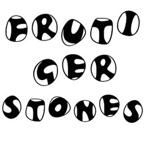
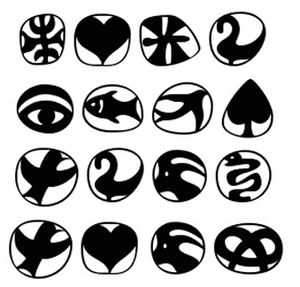
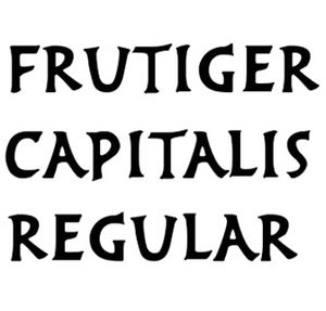
In the 1990s, Frutiger designed fonts inspired by ancient alphabets. These included Herculanum and Pompeijana, based on Roman brush lettering. Rusticana was inspired by Roman carvings. He also created Frutiger Stones, a fun design based on the shapes of pebbles.
Later in his career, Frutiger worked with other designers to update his most famous fonts: Univers, Frutiger, and Avenir. These new versions used modern digital tools to create more styles and look better on screens. Univers became Linotype Univers with 63 variations. Frutiger was reissued as Frutiger Next with more weights. He also expanded Avenir into Avenir Next. Frutiger called updating Univers a "personal gift."
However, Frutiger wasn't always happy with all the changes. For example, he preferred the slanted (oblique) style he originally drew for Frutiger Next, but a different, more curved italic was used. He felt he was "too soft" to argue against it.
In 2009, Frutiger worked with Akira Kobayashi again to release Neue Frutiger. This version went back to the look of the original 1970s Frutiger font.
Frutiger wrote a detailed book about his life and work called Typefaces: the Complete Works. In it, he talked about all his projects, both finished and unfinished.
Death
Adrian Frutiger passed away on September 10, 2015, in Bremgarten bei Bern, at 87 years old.
Adrian Frutiger's Typefaces
Here are some of the typefaces Adrian Frutiger designed:
- Ondine (1954): A decorative font inspired by Arabic writing.
- Président (1954): A font for titles, with small, decorative lines.
- Méridien (1955): A text font with crisp, wedge-shaped serifs.
- Egyptienne (1956): A slab-serif font with a human touch.
- Univers (1957)
- Apollo (1962): Created for Monotype, similar to Méridien.
- Serifa (1967): A slab serif font based on the Univers family.
- OCR-B (1968)
- Iridium (1975): A serif text font with a flared style.
- Frutiger (1976)
- Glypha (1977): Similar to Serifa.
- Icone (1980): A wedge serif font with a gentle flare.
- Breughel (1982): An old-style serif font inspired by the Renaissance.
- Versailles (1982)
- Linotype Centennial (1986)
- Avenir (1988)
- Westside (1989): A unique slab serif font inspired by the Wild West.
- Herculanum (1990)
- Vectora (1990)
- Linotype Didot (1991)
- Pompeijana (1992)
- Rusticana (1993)
- Frutiger Stones (1998)
- Frutiger Symbols (1998)
- Linotype Univers (1999)
- Frutiger Next (2000)
- Nami (2006): A playful font developed with Akira Kobayashi.
- Frutiger Arabic (2007): An Arabic font designed by Nadine Chahine with Frutiger's help.
- Frutiger Serif (2008)
- Neue Frutiger (2009)
- Univers Next (2010)
Awards and Honors
Adrian Frutiger received many awards for his work, including:
- 1950 — Federal department of the Interior Prize, Switzerland
- 1970 — Chevalier dans l'ordre des Arts et des Lettres (Knight in the Order of Arts and Letters), France
- 1986 — Gutenberg Prize of the International Gutenberg Society and the City of Mainz (Germany)
- 1987 — Gold Medal of the Type Directors Club of New York
- 1993 — Grand Prix National des Arts Graphiques (France)
- 2006 — Typography Award from The Society of Typographic Aficionados (SOTA)
- 2009 — European Design Hall of Fame
Who Uses Frutiger's Typefaces?
Many famous organizations and companies use Adrian Frutiger's fonts:
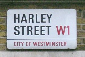
- Univers: Deutsche Bank, Swiss International Air Lines, the Paris Métro, Ordnance Survey, ICICI, and CNN.
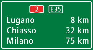
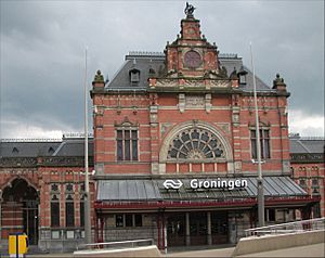
- Frutiger: The Swiss government, the NHS in the UK, the Dutch rail network, Scania, and many universities like Ohio and the London School of Economics.
- Avenir: Apple Maps, the BBC, and Best Buy.
Other Projects
In 2003, a Swiss watchmaker asked Frutiger to design a new watch face. He also designed three stamps for the Swiss post office to celebrate Swiss graphic design.
He created a special logo for the National Institute of Design in India. The institute even changed its name to match his unique logo design. Frutiger also designed a set of symbols for the foundation he started with his wife.
See also
 In Spanish: Adrian Frutiger para niños


