
Hertzsprung–Russell diagram facts for kids


The Hertzsprung-Russell diagram is a special graph that helps us understand stars. It shows how bright a star is (its luminosity) compared to how hot it is. These diagrams are not maps of where stars are in space. Instead, they plot each star based on its brightness and temperature.
People often call them H-R diagrams or HRDs for short. The diagram you see here is based on thousands of stars in our own Milky Way galaxy. Two astronomers, Ejnar Hertzsprung and Henry Norris Russell, created this helpful tool.
Contents
How to Read an H-R Diagram
To understand an H-R diagram, you need to know what its axes mean.
Star Brightness: The Vertical Axis
The vertical line on the side of the diagram shows how bright stars are. This is like measuring their brightness if they were all the same distance away. Scientists call this their absolute magnitude. The brighter a star is, the higher it will be placed on this chart.
Star Temperature: The Horizontal Axis
The horizontal line at the bottom shows the surface temperature of the stars. But here's a trick: the temperatures go down as you move to the right. So, the hottest stars are on the left side. They can be hotter than 30,000 Kelvins. The coolest stars are on the right, around 3000K.
Star Color and Temperature
A star's temperature is closely linked to its color.
- The hottest stars are blue-white.
- Stars with middle temperatures, like our Sun, are yellow.
- The coolest stars are red.
Even the "coolest" stars are still incredibly hot, usually around 5000 degrees Fahrenheit!
When these diagrams were first made in the early 1900s, scientists didn't know how to measure a star's exact temperature. So, they used the star's color instead. Blue-white stars were on one side, and red stars were on the other.
Where Stars Live on the Diagram
When you plot many stars on an H-R diagram, they tend to group together. Stars in the same area of the diagram have similar brightness and temperature.
The Main Sequence Stars
The most common place for stars to be is along a curved line called the Main Sequence. This line goes from the top-left (hot and bright stars) to the bottom-right (cooler and less bright stars). Most stars, including our Sun, spend most of their lives on the Main Sequence.
Red Giants and White Dwarfs
Above the Main Sequence, you'll find another group of stars called red giants. These stars are very big and bright, but cooler than Main Sequence stars. Below the Main Sequence is a curved line of white dwarfs. These stars are very small and hot, but not very bright.
Stellar Life Cycles
These groups of stars are important for understanding how stars change over time, which is called stellar evolution.
- Stars are usually born and spend most of their lives on the Main Sequence.
- After billions of years, they expand and become red giants.
- Then, after another billion years or so, they shrink down into white dwarfs.
Scientists in the 1930s and 1940s started to understand how nuclear fusion powers stars like our Sun. Today, H-R diagrams are a great way to teach students about the life cycle of stars. They are not used as much for creating new theories anymore.
Our Sun is plotted right in the middle of the Main Sequence. It has a brightness of 1 and a temperature of about 5780K. This means our Sun is a yellow star, belonging to a group called "class G" stars.
Images for kids
-
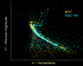
H-R diagrams for two open star clusters, M67 and NGC 188. They show how stars in clusters change as they get older.

See also
 In Spanish: Diagrama de Hertzsprun-Russell para niños
