
Fraktur facts for kids
| This article contains special characters. Without proper rendering support, you may see question marks, boxes, or other symbols. |
| Latin script (Fraktur hand) |
|
|---|---|
 |
|
| Type | Alphabet |
| Spoken languages | German and some other European languages |
| Time period | 16th–20th centuries |
| Parent systems |
Blackletter
|
| Child systems | Kurrentschrift, including Sütterlin |
| Sister systems | See Blackletter |
| Unicode range | 0020–00FF |
| ISO 15924 | Latf |
| Note: This page may contain IPA phonetic symbols in Unicode. | |

Fraktur (pronounced fruck-TOOR) is a unique style of writing, or a "typeface," that belongs to the Latin alphabet. It's part of a group of typefaces called blackletter. The letters in Fraktur look like their strokes are broken or separated. This is different from common typefaces like Antiqua, where the letter strokes are smooth and connected.
The word "Fraktur" comes from the Latin word frāctūra, which means "a break." This is the same root as the English word "fracture."
Fraktur was often called "the German typeface." This is because it stayed popular in Germany and Eastern Europe for a long time, even after other countries started using different styles. In Germany, there was a big debate about switching to more modern typefaces. This debate ended in 1941 when the government ordered that Fraktur typefaces should no longer be used. Sometimes, people use the word "Fraktur" to mean all blackletter typefaces, but this isn't quite right in the world of typography.
Contents
What Makes Fraktur Special?
Besides the usual 26 letters of the ISO basic Latin alphabet, Fraktur includes some special characters:
- The letter ⟨ß⟩, called Eszett in German.
- Vowels with umlauts, like Ä, Ö, Ü.
- The ⟨ſ⟩, which is called the long s.
Some Fraktur typefaces also have a different way of writing the letter 'r', called the r rotunda. Many also include ligatures. Ligatures are when two or more letters are joined together to form a single symbol, like "ch" or "ck." These came from old handwriting styles.
One interesting thing about Fraktur is that in the small letter ⟨o⟩, the left side of the curve is broken, but the right side is not. In old Danish texts written in Fraktur, the letter ⟨ø⟩ was used instead of the German and Swedish ⟨ö⟩.
How Fraktur Started
The first Fraktur typeface was created in the early 1500s. Emperor Maximilian I wanted a new typeface for a large woodcut artwork called the Triumphal Arch. So, he asked Hieronymus Andreae to design it.
Fraktur typefaces for printing became popular thanks to a publisher named Johann Schönsperger in Augsburg. He used Fraktur for some of Maximilian's important books, like his Prayer Book (1513) and the illustrated poem Theuerdank (1517).
Fraktur quickly became more popular than older typefaces like Schwabacher and Textualis. It became very common in German-speaking countries and areas influenced by Germany, such as Scandinavia, Estonia, and Latvia. In the 1700s, the German Theuerdank Fraktur was improved by Johann Gottlob Immanuel Breitkopf, who created the Breitkopf Fraktur.
Over the centuries, most European countries switched to the Antiqua typeface. However, German speakers continued to use Fraktur for a long time.
Where Fraktur Was Used
- Page samples
-
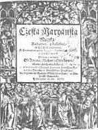
A Czech example of Fraktur: Title page of Česká mariánská muzika by Adam Václav Michna z Otradovic (1647).
-
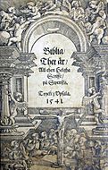
Front page of Gustav Vasa's Bible from 1541, using Fraktur. The title means: "The Bible / That is / All the Holy Scriptures / in Swedish. Printed in Uppsala. 1541".
-
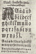
Polish alphabet, 16th century.
-
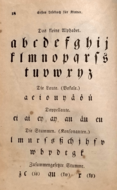
German alphabet from an 1850s American Mennonite children's book.


.jpg)
In the early 1900s, Fraktur was still very common in all German-speaking countries, as well as in Norway, Estonia, and Latvia. It was used a little bit in Sweden, Finland, and Denmark too.
From the late 1700s to the late 1800s, Fraktur was slowly replaced by Antiqua in most European countries. This change was a big deal in Germany and led to a heated debate known as the Antiqua–Fraktur dispute. The switch mainly affected scientific writing in Germany, but most stories, poems, and newspapers still used Fraktur.
Fraktur typefaces continued to be used in Nazi Germany at first. They were presented as a truly German script. Official Nazi documents and even the cover of Hitler's book Mein Kampf used a version of Fraktur. However, by January 3, 1941, the Nazi Party changed its mind. They issued a decree that banned Fraktur, calling it "Jewish letters," and ordered the use of international scripts like Antiqua instead. Some historians believe this was because the regime thought Fraktur made it harder to communicate in the areas they had taken over during World War II.
Fraktur After 1941
Even after Fraktur was officially banned, some publications still used parts of it in their headlines. A few academic books even continued to use Fraktur in their main text. For example, a book by Joachim Jeremias was published in 1963 using Fraktur. Fraktur had a small comeback after the war, but then it mostly fell out of common use.
Today, Fraktur is mainly used for decoration. You might see it on the names of traditional German newspapers, like the Frankfurter Allgemeine, or the Norwegian Aftenpoſten. It's also popular for signs on pubs and other traditional places. When used decoratively today, the old rules about using the long s and ligatures are often ignored.
Individual Fraktur letters are sometimes used in mathematics. For example, a Lie group might be written as G, while its related Lie algebra is written as  .
.
Fraktur is still used by some traditional Anabaptists to print German texts. Groups like the Amish, Old Order Mennonites, and Hutterites use Fraktur for their printed materials. They also use Kurrent for handwriting German texts.
Fraktur Letter Samples


The German sentence shown in the images below is: Victor jagt zwölf Boxkämpfer quer über den Sylter Deich. This means "Victor chases twelve boxers across the Sylt dike." It's a special sentence because it uses all 26 letters of the alphabet, plus the umlauted letters used in German. Sentences like this are called pangrams.


Fraktur in Computers (Unicode)
Unicode is a system that allows computers to show text from all languages. It doesn't treat Fraktur as a completely separate writing system. Instead, Fraktur is seen as a "presentation form" of the Latin alphabet. This means that special joined letters (ligatures) needed for Fraktur are usually handled by the font itself, not by Unicode.
However, there are some "Fraktur" symbols in Unicode that are used for Mathematical Alphanumeric Symbols and other special cases. These symbols are mostly for math and phonetics, not for writing full German texts.
- Here are some Fraktur capital letters in Unicode:
𝔄 𝔅 ℭ 𝔇 𝔈 𝔉 𝔊 ℌ ℑ 𝔍 𝔎 𝔏 𝔐 𝔑 𝔒 𝔓 𝔔 ℜ 𝔖 𝔗 𝔘 𝔙 𝔚 𝔛 𝔜 ℨ
- And here are some small Fraktur letters:
𝔞 𝔟 𝔠 𝔡 𝔢 𝔣 𝔤 𝔥 𝔦 𝔧 𝔨 𝔩 𝔪 𝔫 𝔬 𝔭 𝔮 𝔯 𝔰 𝔱 𝔲 𝔳 𝔴 𝔵 𝔶 𝔷
- There's also a bold Fraktur style:
𝕬 𝕭 𝕮 𝕯 𝕰 𝕱 𝕲 𝕳 𝕴 𝕵 𝕶 𝕷 𝕸 𝕹 𝕺 𝕻 𝕼 𝕽 𝕾 𝕿 𝖀 𝖁 𝖂 𝖃 𝖄 𝖅
- And bold small Fraktur letters:
𝖆 𝖇 𝖈 𝖉 𝖊 𝖋 𝖌 𝖍 𝖎 𝖏 𝖐 𝖑 𝖒 𝖓 𝖔 𝖕 𝖖 𝖗 𝖘 𝖙 𝖚 𝖛 𝖜 𝖝 𝖞 𝖟
See also
- Antiqua–Fraktur dispute
- Blackletter
- Breitkopf Fraktur
- Emphasis (typography)
- Eszett (letter ß)
- Fette Fraktur
- Fraktur (folk art)
- Insular script
- Gaelic type
- Kurrent
- Long s
- Mathematical Alphanumeric Symbols
- Sütterlin
- Uncial script
 In Spanish: Fraktur para niños
