Minimalism facts for kids
Minimalism is a style that uses very simple ideas, shapes, or sounds. It became popular in art and music in America during the 1960s and 1970s. The main idea of minimalism is to use as few things as possible to make something powerful.
Sometimes, a simple idea is repeated many times until it seems very complicated. Today, minimalism can be found in many areas like design, architecture, poetry, and movies.

Contents
Minimalist Music
In music, minimalism is a way of writing classical music that became popular in the second half of the 20th century. It involves using a simple musical idea and repeating it many times.
A minimalist piece of music usually starts with a short idea. This could be a melody or a rhythm. The idea is then repeated over and over, but it changes slightly each time.
Sometimes, two or more instruments might start playing their notes or chords together. But one instrument might play a little faster than the other. This makes them gradually go "out of sync" (not playing together). Eventually, they catch up and play together again. This music is usually tonal, meaning it stays in one musical key. A steady beat is kept throughout the whole piece.
Famous Minimalist Composers
Composers who wrote minimalist music include Steve Reich (born 1936), Philip Glass (born 1937), and Terry Riley (born 1935). Other composers, like John Adams (born 1947), have also used minimalist ideas. However, they often mixed these ideas with other styles.
Minimalist music became popular in the 1960s and 1970s. These composers started writing this way partly because a lot of new music at that time was very complicated. It was often serial music, which was atonal (without a clear key) and had no obvious melodies that were easy to remember.
Listening to Minimalist Music
Minimalist music might sound simple, but it's not always easy to play or understand. It can create a hypnotic feeling, which is what the composer wants.
For example, Steve Reich's Clapping Music only uses hand clapping. There is no melody. Reich was inspired by African drum music when he wrote it. Two performers start by clapping a rhythm together. After a short time, the second performer shifts their rhythm slightly. This happens again and again, until the two performers are clapping together again at the end. You need to listen to this music in a different way than other kinds of music.
Minimalist Visual Art
Minimalism in visual art is sometimes called literalist art or ABC Art. It started in New York in the 1960s. This art had a lot in common with earlier art styles that used simple shapes, like geometric abstraction.
Many artists whose work was called "minimalist" by critics did not actually like the name. They didn't see it as a specific art movement.
Frank Stella's Stripe Paintings
One of the first artists linked to Minimalism was the painter Frank Stella. His early "stripe" paintings were shown in 1959. In these paintings, the width of the stripes was decided by the size of the wood used to build the frame behind the canvas. So, the way the painting looked was partly decided by how it was built, not just by the artist's choice.
A writer named Carl André said about Stella's work, "Art excludes the unnecessary. Frank Stella has found it necessary to paint stripes. There is nothing else in his painting."
These simpler works were very different from the busy and emotional abstract expressionist paintings of artists like Willem de Kooning. Minimalist art was more like the calm "color field" paintings by artists such as Barnett Newman and Mark Rothko. Even though Stella became famous quickly, other artists like Kenneth Noland and Robert Ryman were also exploring stripes and simple, solid colors in their art during the late 1950s and 1960s.
Images for kids
-
Tony Smith, Free Ride, 1962, a large sculpture.
-
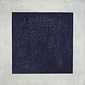
Kazimir Malevich, Black Square, 1915, a famous minimalist painting.
-
The reconstruction of Ludwig Mies van der Rohe's German Pavilion in Barcelona, an example of minimalist architecture.
-
330 North Wabash in Chicago, a minimalist building by Ludwig Mies van der Rohe.
-
Ryōan-ji dry garden in Japan. Its simple design shows the Japanese idea of "wabi-sabi".
-
A warming stripes graphic showing global warming. Blue means cooler years, and red means warmer years.
See also
 In Spanish: Minimalismo para niños


