
Complementary colors facts for kids


.png)
Complementary colors are pairs of colors that look great together. When you place them side-by-side, they make each other stand out a lot! You might also hear them called "opposite colors."
When these colors are mixed together, they can cancel each other out. This means they lose their bright color and become a grayscale color, like white or black.
The exact pairs of colors that are considered complementary can change depending on the color system you are using:
- In modern color systems, like the ones used for computer screens (RGB) or printing (CMY), the main complementary pairs are red–cyan, green–magenta, and blue–yellow.
- In the older, traditional color system (RYB), which many artists still use, the complementary pairs are red–green, yellow–purple, and blue–orange.
- A theory about how our eyes see color, called the opponent process theory, suggests that the most opposite color pairs are red–green and blue–yellow.
- The pair of black and white colors is considered complementary in all these systems.
These different ideas come from how color science has changed over time. Also, the names we use for colors can be a bit general. For example, "blue" can mean many shades, from light blue to dark blue-violet.
Contents
How Colors Work in Different Ways
Traditional Color System
The traditional color wheel was created in the 1700s. Many artists still use it today. In this system, red, yellow, and blue are the main or "primary" colors.
The complementary pairs in this system are red–green, blue–orange, and yellow–purple.
- A complementary pair always has one primary color (like yellow) and one "secondary" color (like purple). Secondary colors are made by mixing two primary colors.
- For example, to find the complementary color of yellow, you would mix the other two primary colors: red and blue. This makes purple, which is directly across from yellow on the color wheel.
- When you mix yellow and purple paints, you are essentially mixing all three primary colors. Since paints work by absorbing light, mixing all three primary colors together usually makes a black or gray color. This is called subtractive color mixing.
- Modern painting often uses more precise primary colors for mixing: magenta, cyan, and yellow.
Complementary colors can create cool visual tricks.
- The shadow of an object often seems to have a bit of its complementary color. For instance, the shadow of a red apple might look a little blue-green. Painters sometimes use this trick to make shadows look more real and vibrant.
- If you stare at a color for about 45 seconds and then look at a white wall, you will briefly see an afterimage of the object in its complementary color.
- When complementary colors are placed side-by-side as tiny dots, they can appear gray when you look at them from a distance.
Colors Made by Light
The RGB color model was developed in the 1800s and 1900s. It uses combinations of red, green, and blue light to create the colors you see on a computer monitor or TV screen.
- In the RGB model, the primary colors are red, green, and blue light.
- The complementary pairs are red–cyan, green–magenta, and blue–yellow.
- When you combine the light of two complementary colors, like red and cyan, at full brightness, they create white light. This is because these two colors together contain all the colors of the light spectrum. If the light is not at full brightness, the result will be gray.
Other color models, like the HSV color space, show neutral colors (white, grays, and black) along a central line. Complementary colors are found directly opposite each other on any flat slice of this color model.
-

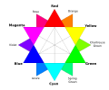
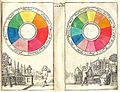
A traditional color star from 1867. The complementary colors used by artists like Van Gogh and Monet are directly opposite each other.
-
The colors of the RGB color model. This model uses red, green, and blue light to make colors on screens. Complementary colors are opposite each other.
-
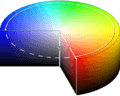
The HSV color wheel shows complementary colors in three dimensions.
-
A chart showing different color combinations.
.svg)


Colors for Printing

Color printing uses subtractive colors, similar to painting, but with different primary colors. Printing uses the CMYK color model, which makes colors by layering cyan, magenta, yellow, and black inks.
- In printing, the most common complementary colors are magenta–green, yellow–blue, and cyan–red.
- This model gives the same complementary pairs as the RGB model when thinking about opposite colors. Black ink is added when needed to make colors darker.
Complementary Colors in History and Art
In Color Theory
People have noticed how colors affect each other for a very long time.
- In ancient Greece, Aristotle wrote that colors change when light hits them.
- Later, thinkers like Saint Thomas Aquinas and Leonardo da Vinci also observed that certain colors looked better next to each other. Leonardo noted that the best matches were between colors that were exactly opposite. But no one really knew why until the 1700s.
In 1704, Isaac Newton created a circle showing seven colors of the spectrum. He noticed that colors opposite each other on the circle created the strongest contrast. He pointed out pairs like red and blue, yellow and violet, and green and a purplish-red.
Over the next decades, scientists improved Newton's color circle. They eventually made a twelve-color wheel. This wheel included three primary colors (yellow, blue, red), three secondary colors (green, purple, orange), and six "tertiary" colors (made by mixing primary and secondary colors).
In 1794, the scientist Benjamin Thompson (also known as Count Rumford) came up with the word complement to describe two colors that make white when mixed. He noticed that a blue color appeared in the shadow of yellow candlelight. He thought that "To every color... there is another in perfect harmony to it, which is its complement." He also suggested that this discovery could help people choose colors for clothes or home decorating.
In the early 1800s, many scientists and thinkers studied colors.
- The German poet Johann Wolfgang von Goethe had his own color theory in 1810. He believed yellow and blue were the main opposite colors, representing light and darkness. He also suggested complementary pairs like yellow–violet and orange–blue. Goethe's ideas were very popular and influenced artists like J. M. W. Turner.
- Around the same time, a British scientist named Thomas Young discovered that you could make white light by combining just three colors: red, green, and blue. This was the start of understanding additive colors, which is how colors are made on computer and TV screens today. He also figured out that our eyes have three types of color receptors, which was a big step in understanding color vision.
Another British scientist, David Brewster, thought the true primary colors were red, yellow, and blue. He believed the complementary pairs were red–green, blue–orange, and yellow–purple. Later, a German scientist, Hermann von Helmholtz, settled the debate. He showed that colors made by light (additive colors) and colors made by pigments (subtractive colors) follow different rules and have different primary and complementary colors.
Other scientists looked more closely at how complementary colors are used. In 1828, the French chemist Eugene Chevreul showed that "the arrangement of complementary colors is superior to any other harmony of contrasts." His book from 1839 explained how complementary colors could be used in everything from fabrics to gardens. This made complementary colors a popular idea. French art critic Charles Blanc and American color theorist Ogden Rood also wrote popular books about complementary colors. These books were eagerly read by painters like Georges Seurat and Vincent van Gogh, who used these ideas in their art.
-
Newton's color circle (1704) showed seven colors. He said colors opposite each other had the strongest contrast.
-
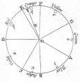
A Boutet color circle from 1708 showed traditional complementary colors: red and green, yellow and purple, and blue and orange.
-
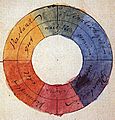
The color wheel by Johann Wolfgang von Goethe (1810) was based on the idea that yellow and blue, representing light and darkness, were opposite.


In Art
In 1872, Claude Monet painted Impression, Sunrise. It showed a small orange sun and orange light on the clouds and water, set against a hazy blue background. This painting, with its strong use of the complementary colors orange and blue, gave its name to the impressionist art movement. Monet knew about the science of complementary colors and loved to use them. He wrote in 1888 that "color makes its impact from contrasts rather than from its inherent qualities."
Orange and blue became a very important color combination for all the Impressionist painters. They had all read the new books on color theory. They knew that orange next to blue made both colors look much brighter.
- Auguste Renoir painted boats with bright orange paint.
- Paul Cézanne used orange made from yellow, red, and brown against a blue background.
Vincent van Gogh was especially famous for using this technique. He made his own orange colors by mixing yellow, brown, and red. He placed them next to shades of red and green, and under a sky of swirling blue and violet. He also painted an orange moon and stars in a deep blue sky. He wrote to his brother Theo about "searching for oppositions of blue with orange, of red with green, of yellow with purple." He wanted to make colors intense, not just a mix of grays.
When describing his painting, The Night Café, to his brother Theo in 1888, Van Gogh wrote: "I tried to show terrible human feelings with red and green. The room is blood-red and pale yellow, with a green billiard table in the middle, and four lemon-yellow lamps with orange and green rays. Everywhere it is a battle of the most different reds and greens."
-
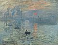
Impression, Sunrise by Claude Monet (1872) shows a tiny but bright orange sun against a blue background. This painting named the Impressionist movement.
-
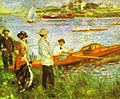
Oarsmen at Chatou by Pierre-Auguste Renoir (1879). Renoir knew that orange and blue made each other brighter when placed side by side.
-
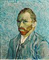
In this self-portrait (1889), Vincent van Gogh used the strong contrast between his orange hair and the blue background.
-
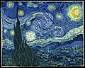
Starry Night by Vincent van Gogh (1889) has orange stars and an orange moon.
-
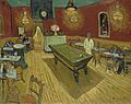
The Night Café by Vincent van Gogh (1888) used red and green to show what van Gogh called "terrible human passions."


Afterimages
- Further information: Afterimage#Negative afterimages
If you stare at a single color, like red, for about 30 seconds to a minute, and then look at a white surface, you will see an afterimage of its complementary color (in this case, cyan). This happens because the parts of your eye that see red light get tired. When you then look at white light, which contains all colors, the red-seeing parts don't work as well. This makes you see the other colors more strongly, creating the illusion of the complementary color. The illusion goes away as your eyes rest.
Practical Uses
Using complementary colors is important in creating appealing art and graphic design. It's also used in other areas, like making logos stand out or arranging items in stores. When placed next to each other, complementary colors make each other look brighter and more noticeable.
Complementary colors also have very practical uses:
- Because orange and blue are complementary, life rafts and life vests are often orange. This makes them stand out as much as possible against the blue ocean, making them easier to spot from ships or planes.
- Red and cyan glasses are used in the Anaglyph 3D system to create 3D images on computer screens.
-

Orange life rafts are easy to see against blue water.
-
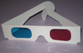
Red and cyan glasses are used to view Anaglyph 3D images.
-

This image will appear in three dimensions when viewed with red and cyan 3D glasses.
_check_life_rafts_for_survivors_Sept._6,_2009_following_the_sinking_of_a_Philippine_super_ferry.jpg)


See also
 In Spanish: Colores complementarios para niños
- Complementary wavelength
- Inverted spectrum
- Opponent process
