Paralympic symbols facts for kids
The Paralympic symbols are special icons, flags, and other signs used by the International Paralympic Committee to celebrate and promote the Paralympic Games. They help people around the world recognize and feel excited about the Games.
Contents
- What is the Paralympic Motto?
- The Paralympic Symbol: What Does it Mean?
- Paralympic Emblems: Unique Designs for Each Games
- The Paralympic Flag
- The Paralympic Flame and Torch Relay
- Paralympic Medals
- The Paralympic Anthem
- The Paralympic Oath
- The Paralympic Order
- Post-Nominal Letters: PLY
- Paralympic Mascots
- See also
- Images for kids
What is the Paralympic Motto?
The official saying, or motto, for the Paralympics is "Spirit in Motion". This motto was first used in 2004 during the Paralympic Games in Athens, Greece. Before that, the motto was "Mind, Body, Spirit", which was introduced in 1994. The motto helps remind everyone what the Paralympic Games are all about: the amazing spirit of athletes.
The Paralympic Symbol: What Does it Mean?
The Current Symbol
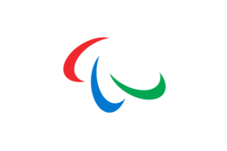
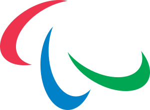
The main symbol of the Paralympic Games is made up of three curved shapes called "agitos". They are colored red, blue, and green, and they all curve around a single point on a white background. The word "agito" comes from Latin and means "I move". This shows that the symbol is all about movement and progress.
The colors of the agitos (red, blue, green) along with the white background are important. They represent the three colors that appear most often in national flags around the world. This shows that the Paralympics bring together athletes from everywhere. The way the three agitos curve around a center point highlights how the International Paralympic Committee (IPC) brings athletes from "all corners of the world together" to compete. The shape also stands for the Paralympic goal: "To enable Paralympic athletes to achieve sporting excellence and inspire and excite the world."
This symbol was created by a design company called Scholz & Friends. It was an updated version of an older symbol that had three colors. The new agitos symbol was first officially used at the closing ceremony of the 2004 Summer Paralympics in Athens. A new Paralympic flag with this symbol was then passed to Beijing, which hosted the 2008 Summer Paralympics. The agitos design was first used in the branding for a Paralympic Games at the 2006 Winter Paralympics.
In October 2019, the IPC updated the Agitos symbol slightly. The curved shapes were made a bit more "strict" and even, and the colors were made brighter to match the colors used in the Olympic rings. The IPC also introduced a new message: "Change Starts with Sport." This message helps show how the Paralympic Movement can change society and support human rights.
Older Paralympic Symbols
The very first official Paralympic logo was made for the 1988 Summer Paralympics in Seoul, Korea. It was based on a traditional Korean design called a pa. Two of these pa shapes make up the taegeuk symbol, which is at the center of the flag of South Korea. The first Paralympic flag used five pa shapes, arranged like the Olympic rings, and they were colored the same way too.
In 1991, the International Olympic Committee (IOC) asked the Paralympic organizers to change their logo. This was because the five pa symbol looked too much like the Olympic rings, which could cause confusion. The IPC members first voted to keep the five pa symbol. However, the IOC made it clear they would not work with the IPC in the future if the symbol stayed the same.
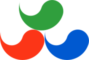
During the 1992 Winter Paralympics, a new, simpler Paralympic symbol was shown. This new symbol used only three pa shapes. These three shapes represented the new motto at the time: "Body, Soul, and Spirit."
After this agreement between the IOC and IPC, the five-pa symbol was stopped after the 1994 Winter Paralympics in Lillehammer, Norway. This was because the organizers in Lillehammer had already started their marketing with the five-pa version. The three-pa version was then used from the end of the Lillehammer Games until the closing ceremonies of the 2004 Summer Paralympics in Athens, Greece.
Paralympic Emblems: Unique Designs for Each Games
Each Paralympic Games has its own special emblem, just like the Olympic Games. These emblems show the vision and ideas for that specific Games. Every emblem is unique and reflects the local design and culture of the host country or city.
You can see many different Paralympic emblems in Category:Summer Paralympic Games and Category:Winter Paralympic Games. These designs include the Paralympic symbol used at the time, the name and year of the event, and special cultural elements from the host country or city.
The International Paralympic Committee (IPC) must approve all Paralympic emblems for the Games. These emblems are used on promotional materials, by sponsors, and on the uniforms of all Paralympic athletes. All emblems are owned by the IPC.
Here are some examples of Paralympic emblems and what they mean:
- Barcelona 1992 – This logo showed a person in a wheelchair in a dynamic pose. It was based on the Olympic logo but adapted to represent a Paralympic athlete. The colors red and yellow were for Spain, symbolizing the sun and life. Blue represented the Mediterranean Sea.
- Lillehammer 1994 – This emblem showed "sun people." It represented ideas like power, energy, and strength, which are all qualities of the athletes.
- Atlanta 1996 – Called ‘Starfire’, this logo represented an athlete's dream coming true and the idea of the phoenix rising. The star was the athlete, and the fire was their passion.
- Nagano 1998 – This logo was designed by Sadahiko Kojima. It looked like a simplified Chinese character for ‘naga’ (Nagano). It also symbolized a rabbit playing in snow or ice, showing the quick movements of rabbits.
- Sydney 2000 – This logo showed a dynamic human shape leaping forward. It also looked like the Paralympic torch and the sails of the Sydney Opera House. The colors (blue, red, green) represented Sydney Harbour, the Outback, and the forests of Australia.
- Salt Lake 2002 – This logo had three parts. The top sphere represented global unity and the head of an athlete. The two curved lines showed an athlete in motion.
- Athens 2004 – Called "Son of Sun," this logo was inspired by the Phaistos disc and the Sun. It showed the profile of an athlete looking forward, symbolizing hope and determination.
- Torino 2006 – This emblem used three graphic elements that looked like human figures soaring upwards.
- Beijing 2008 – Named ‘Sky, Earth and Human Beings’, this logo showed an athlete in motion. It represented the great efforts people with disabilities make in sports and daily life. The three agitos colors (red, blue, green) represented the sun, sky, and earth.
- Vancouver 2010 – "Man becomes Mountain" captured the coast of Vancouver and the forests of Whistler, showing mountains and sky.
- London 2012 – This logo, designed by Wolff Olins, looked like the number 2012. It had the Paralympic Agitos inside the zero. It was designed to be similar to the Olympic logo but with special colored lines and marks to make it unique for the Paralympics.
- Sochi 2014 – This was the only Paralympic emblem to include a web address: "sochi2014.ru". The design mirrored "Sochi" and "2014" to show Sochi as a meeting point between the sea and mountains.
- Rio 2016 – This emblem was a stylized 3D heart. It symbolized inclusion, passion, tolerance, and the warmth of the Brazilian people.
- PyeongChang 2018 – This emblem used a Korean letter that symbolizes snow, ice, and Paralympic athletes. The two letters together represented a big festival for athletes and fans.
- Tokyo 2020 – This emblem featured an indigo checkerboard pattern in a circle, like a hand fan. It showed Japanese elegance and sophistication.
- Beijing 2022 – This emblem was inspired by a Paralympic seated skier with a Chinese ribbon design. It also included the Chinese character "飞" (fēi), which means "fly," and rainbow colors.
- Paris 2024 – For the first time, the Paralympic Games will share the exact same emblem as the Olympic Games. This shows that both events have common goals and ambitions.
- Milan- Cortina 2026 – The emblem, named "Futura," was chosen by public vote. The Paralympic version has a red, blue, and green gradient to symbolize an aurora and the colors of the Paralympic emblem.
- Los Angeles 2028 – The emblems for the 2028 Games were revealed in 2020. They feature an interchangeable "A" to show the many different cultures in Los Angeles.
The Paralympic Flag
 |
|
| Name | The Paralympic agitos |
|---|---|
| Use | Sport |
| Proportion | 3:5 or 1:2 |
| Adopted | 20 October 2019 |
The Paralympic flag has a white background with the Paralympic symbol (the three agitos) in the very center. The current version of the Paralympic flag was first flown in 2019.
The Paralympic Flame and Torch Relay
The Paralympic flame and torch relay are important traditions. Until the 2010 Winter Paralympics, each organizing committee could choose how to light the Paralympic torch. Since the 1988 Summer Paralympics, the torch relay has helped keep excitement high in the host country after the Olympic Games.
Sometimes, the Olympic flame was kept in the host city for the Paralympic Games, like in 1992 and 1994. But usually, each city had its own special way of lighting the torch, respecting its local culture. Often, the Paralympic relay would go to places the Olympic relay didn't visit, like in Atlanta in 1996.
The modern idea of the Paralympic torch relay was first used for the 2002 Winter Paralympics in Salt Lake City. Local flames were lit in 15 communities in Utah. These flames were then brought together in a special cauldron in Salt Lake City the night before the opening ceremonies. The next morning, the final part of the relay began, and the Paralympic cauldron was lit by athletes Chris Waddell and Muffy Davis during the opening ceremony.
This concept was also used for the 2010 Winter Paralympics. Indigenous celebrations were held, and the flame was created through a ritual by representatives of Canadian indigenous nations. The ashes were collected and sent to Vancouver. Local celebrations also took place in other cities. All the collected ashes were combined in a special ceremony, and the Paralympic flame was born, making its way to the opening ceremony.
The idea was made even better for the 2012 Summer Paralympics. Four regional cauldrons were lit in different parts of the Home Nations (England, Northern Ireland, Scotland, and Wales). A fifth "heritage flame" was lit in Stoke Mandeville, England. Stoke Mandeville is very important because it's known as the birthplace of the Paralympic movement. These five flames were then combined at Stoke Mandeville Hospital to create one single flame for the final part of the torch relay to the Olympic Stadium for the opening ceremonies.
After these Games, many people wanted the "heritage flame" from Stoke Mandeville to become a permanent tradition. In 2013, this became official. Starting with the 2014 Winter Paralympics, a ceremonial heritage flame is lit at Stoke Mandeville Stadium. This flame is then added to the Paralympic flame created in the host country. In 2014, athlete Hannah Cockroft even used her wheelchair to create sparks for the flame! In October 2023, it was announced that all future Paralympic torch relays will officially begin with a flame created in Stoke Mandeville, just like the Olympic flame is traditionally lit in Olympia.
Paralympic Medals
The Paralympic medals are another important symbol. They are given to the top three athletes in each event. The first-place winner gets a gold-plated silver medal (called a gold medal), second place gets a silver medal, and third place gets a bronze medal. For each Paralympic Games, the medals have a different design, reflecting the host city and its culture.
The Paralympic Anthem
| Anthem of the Future French: Hymne de l’Avenir German: Hymne der Zukunft |
|
| Official anthem of | the Paralympic Games and the International Paralympic Committee |
|---|---|
| Lyrics | Graeme Connors, 2001 |
| Music | Thierry Darnis, March 1996 |
| Adopted | 1996 |
The Paralympic Anthem, also known as the Paralympic Hymn, is a special song played when the Paralympic Flag is raised during ceremonies. The music for this song, called "Hymne de l’Avenir" (which means "Anthem of the Future" in English), was composed by Thierry Darnis. The IPC approved this anthem in March 1996. An Australian country singer named Graeme Connors wrote lyrics for the anthem in 2001, but as of 2023, these lyrics have not yet been officially used.
The Paralympic Oath
The Paralympic Oath is a serious promise made at the opening ceremonies of each Paralympic Games. One athlete from the host country's team makes the promise for all the competing athletes. One judge makes the promise for all the officials and referees. And one coach makes the promise for all coaches and team staff.
The athlete holds a corner of the Paralympic Flag while saying their promise:
Athletes' Oath
- In the name of all the competitors I promise that we shall take part in these Paralympic Games, respecting and abiding by the rules which govern them, committing ourselves to a sport without doping and without drugs, in the true spirit of sportsmanship, for the glory of sport and the honour of our teams.
The judge, also from the host country, holds a corner of the flag and says a slightly different promise:
Judges' Oath (Officials' Oath)
- In the name of all the judges and officials, I promise that we shall officiate in these Paralympic Games with complete impartiality, respecting and abiding by the rules which govern them in the true spirit of sportsmanship.
The coach, from the host nation, also holds a corner of the flag and makes their promise:
Coaches' Oath
- In the name of all coaches and other members of the athletes entourage, I promise that we shall commit ourselves to ensuring that the spirit of sportsmanship and fair play is fully adhered to and upheld in accordance with the fundamental principles of the Paralympic movement.
History of the Oath
The first Paralympic Oath was taken at the very first Paralympic Games in Rome in 1960. The words of the Paralympic Oath are almost the same as the Olympic Oath, just with "Paralympic" instead of "Olympic." The original Olympic Oath was written by Pierre de Coubertin. The first athlete's oath was taken at the Olympic Games in Antwerp in 1920. The first judge's oath was taken at the Olympic Games in Sapporo in 1972. The first coach's oath was taken at the Paralympic Games in London in 2012.
The Paralympic Order
The Paralympic Order is the highest award given in the Paralympic Movement. People who receive this award get a special medal with the IPC logo on it. It is given to individuals who have made a truly outstanding contribution to the Paralympic Movement.
Post-Nominal Letters: PLY
Starting in 2022, the International Paralympic Committee introduced special letters, PLY, that athletes can put after their name. This is a way to recognize their important contribution to the Paralympic movement. It's similar to how the International Olympic Committee uses OLY for Olympians. The first people to receive the PLY recognition were Ragnhild Myklebust and Kevin Coombs.
Paralympic Mascots
Each Paralympic Games has its own mascot. These mascots are usually animals that live in the host area, or sometimes they are human-like figures that represent the local culture. Today, many of the toys and other items made for young people feature these mascots, as they are very popular.
See also
- List of Paralympic mascots
- Olympic symbols
Images for kids


