
Edmund Evans facts for kids

Edmund Evans (born February 23, 1826 – died August 21, 1905) was an English wood-engraver and colour printer. He lived during the Victorian era. Evans was known for his amazing full-colour printing. This type of printing became very popular in the mid-1800s, partly because of his work.
He worked with famous artists like Walter Crane, Randolph Caldecott, and Kate Greenaway. Together, they created many classic children's books. Not much is known about Evans's life. But he wrote a short story about his life as a printer in Victorian London before he passed away in 1905.
After finishing his training, Evans started his own business. By the early 1850s, he was well-known for printing covers for cheap novels called yellow-backs. In the early 1860s, he began printing children's toy books and picture books. He worked with the publishing company Routledge and Warne. His goal was to make beautiful and affordable books for children. For 30 years, he produced many books each year. First, Walter Crane illustrated them, and later Randolph Caldecott and Kate Greenaway did.
Evans used a special woodblock printing method called chromoxylography. This method was often used for cheaper books and children's books that didn't need many colours. This helped keep costs down and make more profit. However, chromoxylography allowed for many different shades and tones by mixing colours. The process was complex and needed very detailed engraving to look its best. Evans was very careful and used a hand-press. He sometimes used as many as 12 different colour blocks for just one picture! He became the top wood engraver and colour printer in Britain during the second half of the 19th century.
Contents
How Edmund Evans Started His Career

Edmund Evans was born in Southwark, London, on February 23, 1826. His parents were Henry and Mary Evans. He went to school in Jamaica Row. He liked math but wished he had learned Latin. When he was 13, in 1839, he started working as a "reading boy" at the printing house of Samuel Bentley in London.
However, he was soon moved to be a general errand boy. This was because his stutter made it hard for him to do his reading duties. The work hours were long, from seven in the morning until nine or ten at night. But Evans was fascinated by the printing process and the books they made. Bentley soon saw that the boy was talented. He noticed Evans's early attempts at drawing on slate. So, Bentley arranged for Evans to train with the wood-engraver Ebenezer Landells.
Evans began his training with Landells in 1840. His jobs included delivering drawings to artists like Edward Dalziel or writers like Charles Dickens for their approval. A year later, Landells started Punch magazine. As early as 1842, Evans was illustrating covers for the new magazine. Evans worked and became friends with Myles Birket Foster, John Greenaway, and George Dalziel. Foster and Evans stayed friends for life.
When Landells got a job from the Illustrated London News to make pictures of Queen Victoria and Prince Albert, he sent Evans and Foster to Balmoral. They went to make sketches, which Evans then engraved. Near the end of his training, the Illustrated London News needed so much work that Evans had to work late into the night and return early in the morning.

When his training ended in 1847, Evans was 21. He decided not to work for Landells. Instead, he started his own business as a wood-engraver and colour printer. In 1848, Evans engraved a title page for the Illustrated London News, among other jobs. However, the Illustrated London News stopped hiring him. They said his wood engraving was too detailed for newspaper work. His last print for them showed the four seasons, drawn by Foster. Foster even got his first job from a publisher to paint these four scenes in oil.
In 1851, a company called Ingram chose Evans to engrave three prints for a book called Travels in the Holy Land. He used three blocks for this work. The main block, which outlined the picture, was printed in dark brown. The other two were in a light brown and a grayish-blue. For the same company, Evans also made a book cover using bright reds and blues on white paper. That year, he got his first job to print a whole book. It was written by Fanny Fern and illustrated by Foster. Evans had enough work to train his two younger brothers, Wilfred and Herbert. He also bought a hand-press. Soon, he moved his business to Racquet Court and bought three more hand-presses.
In the early 1850s, Evans designed book covers known as yellow-backs. These were books bound in yellow paper over stiff boards. He made this method perfect and became the top printer for many London publishers. By 1853, he was the main yellow-back printer in the city. He created the yellow-back because he didn't like white paper book covers. They got dirty and discoloured easily. So, he tried using yellow paper and treating it before printing the picture.
Often, yellow-backs were used for books that hadn't sold well. They were like reprints or leftover stock. Evans hired artists like George Cruikshank, Phiz, Randolph Caldecott, and Walter Crane for the pictures. Evans's first cover was very colourful, using only reds and blues. He printed blue over black to make it look like a black background. He kept using red and blue. He engraved the blocks to create lighter shades of red for faces and hands. He also engraved the blue blocks to make textures and patterns. Evans realized that books that might not have sold well the first time could sell easily with good cover art.
.jpg)
In the mid-1850s, Evans and Foster visited Scotland. They made sketches for a series of guide books, which Evans then printed. He later engraved Foster's pictures for Lady of the Lake. He also engraved Foster's pictures for The Poetical Works of George Herbert (1856), printed in Edinburgh. About the George Herbert engravings, he said: "these illustrations I consider the best that I ever engraved." By 1856, Evans had "perfected a process of colour printing from wood blocks." He became known as the best wood engraver and colour printer in London.
In the late 1850s, Evans worked on a book called The Poems of Oliver Goldsmith, illustrated by Foster. It was published in 1859. The book was so popular that a second edition was made. It had 11 more colour-printed pictures and was published in 1860. In the 1860s, his most important work was for James Doyle's A Chronicle of England. This book has 80 pictures and shows how skilled he was with colour. His method of coloured wood engraving allowed watercolours to be copied. He used this for The Art Album: Sixteen Facsimiles of Water-colour Drawings, which he engraved and printed in 1861.
Before he started printing children's books, Evans mostly did colour printing for magazines. These included Lamplighter, The Sunday School Companion, and Chatterbox. With more printing jobs, Evans rented space on Fleet Street to make his business bigger. He added steam engines, boilers, and "many extra machines."
From the late 1850s to the early 1860s, Evans made the blocks and printed books illustrated by William Stephen Coleman. These included Common Objects of the Sea Shore, Common Objects of the Country, and British Butterflies. The printing process used up to 12 colours. He always used a hand-press for these. During these years, he also finished work on Foster's Bible Emblem Anniversary Book. In 1870, Evans printed In Fairyland, a Series of Pictures from the Elf-World. This book was illustrated by James Doyle's brother, Richard. Doyle showed fairies living "among birds, snails, butterflies and beetles as large as themselves." Evans made his largest wood-engravings for this book. The 36 pictures inside are "often considered the masterpiece of Victorian illustration." In the 1860s and 1870s, he employed up to 30 engravers.
In 1864, Evans married Mary Spence Brown, who was Foster's niece. They lived in Witley, Surrey. Foster was their neighbour, as was George Eliot. Evans said about his work: "it kept me fully employed mind and body: I had to direct the engravers to the direction of the lines in the colour blocks, and the printers for the tones of the inks for printing, often mixing the inks." Whenever he could, he visited Brighton, where he enjoyed the fresh air.
How Evans Printed in Colour
During the Victorian period, book illustration became very popular. This was helped by the work of wood engravers. Woodcuts had been used for centuries in Europe and even longer in Asia. Usually, the parts to be printed in black were left raised by the carver. This allowed pictures to be printed along with the text. Thomas Bewick improved this technique in the 18th century. He "perfected the process that was used widely throughout the 19th century." This involved using hardwood blocks and tools for metal engraving. The usual way to engrave was to work with the wood grain on the side of a block. But Bewick worked on the end of the block and carved against the grain using a burin. Bewick taught his methods to his students, including Landells, who then taught Evans. In the 1860s, Thomas Bolton found a way to put a photograph onto a block. This allowed the engraver "to work on the surface."

In the 1830s, George Baxter made colour relief printing, called chromoxylography, popular again. He used a background plate printed in aquatint intaglio. Then, colours were printed in oil inks from raised plates, usually wood blocks. Evans followed Baxter's process, but he only used raised wood blocks. For The Poems of Oliver Goldsmith, Evans made a copy of a watercolour painting. He did this by adding colours one by one using separate colour blocks. This helped him get the gradual colours of the original. First, Foster drew the picture directly on the woodblocks that would be cut. Then, he made a coloured paper copy of the drawing. Evans used the same pigments as Foster, grinding them himself. He made inks to match Foster's colours. The printing was done using a hand-press. Each picture needed nine or ten print runs.
For A Chronicle of England, Evans engraved pictures that were placed every six pages in the text. Doyle drew the pictures directly onto the wood blocks and made coloured proofs. Nine or ten wood blocks (colour blocks) were used for each of the 80 pictures. Evans printed these again on a hand-press. His use of colour and his ability to create soft tones show Evans's skill as a colourist. His work was special because of the excellent quality of his wood engraving (carving). Also, he limited the amount of ink he used to create a more striking result.


Evans's printing process had several steps. First, a line drawing of a picture was photographed and printed onto a block. Then, the line drawing was engraved. The illustrator would colour proofs of the main block. Evans would then "figure out the order and exact placement... to get a close copy of the artist's original." Blocks were painted and engraved, one for each colour. A proof of each colour block was made before a final proof from the main block. Ideally, the proof would be a perfect copy of the original drawing. But Evans believed a print was never as good as a drawing. He took care to grind and mix his inks so they looked very much like the original colours. Finally, each block was placed carefully. This allowed the individual colours to print on the page exactly as intended.
He was aware of costs and printing speed. So, he used as few colours as possible. Pictures were made with a black base, plus one or two colours and a skin tone for faces and hands. Sometimes, Evans used as few as four colour blocks. These were likely black, skin tone, and two primary colours. Adding yellow gave him more options. Each colour was printed from a separately engraved block. There were often between five and ten blocks. The main challenge was to keep everything perfectly lined up. This was done by making small holes in exact spots on each block where the paper was pinned. If done correctly, the colours would match up. Sometimes, though, you can see ink squashed along the edges of a picture.
Often, the artist drew the picture backward, directly onto a block. In other cases, the printer copied the picture from a drawing. After the 1860s, images could be projected onto the blocks using photography. However, it was harder for the printer to carve the raised parts without losing the clear lines of the picture. Books printed by Evans have been copied using some of the original blocks. These blocks have "remained in continuous use for over a century."
Amazing Children's Books
Many experts believe Evans's most important work was printing children's books in the late 1800s. He worked with Walter Crane, Kate Greenaway, and Randolph Caldecott. Their work changed children's publishing forever. Early in the 1800s, children's books were often coloured by hand. But the chromoxylography process Evans perfected "brought a huge improvement in coloured picture books for children."
In 1865, Evans made a deal with the publishing company Routledge and Warne. He would provide toy books. These were paper-bound books with six pages, sold for sixpence each. They "changed children's books completely." This also connected Evans with famous children's book illustrators. The demand for toy books grew so much that he started to publish them himself. He also hired artists to create the pictures. When he couldn't keep up with the orders, he hired other engraving companies to help.

The idea of a picture book for children, where the art is more important than the words, started in the mid-1800s. According to Judith Saltman, Evans's work as a printer of children's picture-books is very special. She thinks he printed the "most memorable illustrated books for children" in the Victorian era. She also believes the three illustrators he worked with are the "founders of the picture-book tradition in English and American children's books."
He thought full-colour printing was perfect for the simple pictures in children's books. Evans didn't like the poorly coloured children's book pictures. He believed they could be beautiful and cheap if enough copies were printed to cover the costs. To do this, Evans hired Walter Crane, Kate Greenaway, and Randolph Caldecott as illustrators. All of them became successful because Evans "recognized, encouraged, and brilliantly reproduced their colours."
Walter Crane's Books

In 1863, Evans hired Walter Crane to draw covers for cheap novels. These were sold in train stations and were called "yellow backs" because of their yellow covers. In 1865, they started working together on toy books of nursery rhymes and fairy tales. Between 1865 and 1876, Crane and Evans made two or three toybooks each year. The first books in this series (which became very popular) used only two colours, red and blue. Black or blue was used for the main outline.
Crane illustrated the early books printed by Evans, like This Is the House That Jack Built and Sing a Song of Sixpence. These books had simple designs without much background decoration. They were printed only in red, blue, and black. Between 1865 and 1886, Crane illustrated 50 toybooks. All of them were engraved and printed by Evans. These books sold very well and made Crane one of the most popular children's book illustrators in England.
Crane drew his designs directly onto the blocks. His designs slowly became more detailed. This was because Crane was influenced by Japanese prints. In 1869, Evans added yellow. He mixed it with red and blue to create more colours. The next year, Crane received some Japanese prints. He was impressed by "the clear black outline, the bright flat colours, as well as delicate colours." He used these ideas in his toy book pictures. His interest in small details, like furniture and clothes, can be seen in his illustrations. During these years, Crane and Evans worked for Routledge. They worked together on books like The Yellow Dwarf, Beauty and the Beast, and Goody Two Shoes. Crane sold his pictures directly to the publisher. Because of printing and engraving costs, many copies had to be printed.
Crane was abroad from 1871 to 1873. Evans continued to print his work. Evans received Crane's pictures by mail. He would photograph the image onto the main block to be engraved. Then, he would send a proof back to Crane for colouring. In 1878, Crane and Evans worked together on The Baby's Opera. This was a complex project with 12 fully illustrated pages and decorative borders on all 56 pages. Crane visited Evans at his home in Witley to design the book. Evans gave Crane a blank book to plan the layout of the whole volume. The first printing had 10,000 copies. But Evans quickly printed more as the book became very popular. Evans added more colours to the pictures. "Light blues, yellows, and brick reds, softly blended" replaced the brighter colours of earlier work.
In 1880, Crane illustrated, and Evans printed, The Baby's Bouquet: a Fresh Bunch of Old Rhymes and Tunes. This book sold hundreds of thousands of copies. The book shows influences from the Pre-Raphaelites, Japanese art, and the beginning of the arts and crafts movement. In 1889, Flora's Feast: A Masque of Flowers was published. It showed flowers as human figures. For this book, Evans used as many as eight colour blocks. Their later collaborations include an edition of Alice in Wonderland with coloured versions of John Tenniel's 1890 pictures, and the 1899 A Floral Fantasy in an Old English Garden.
Randolph Caldecott's Books

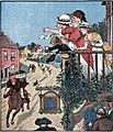
The constant work made Crane stop for a while. So, Evans replaced him with Randolph Caldecott. Evans had seen and liked Caldecott's magazine pictures. Evans first hired Caldecott to draw pictures for nursery rhyme books. They started with another printing of The House that Jack Built in 1877. Evans suggested filling each page with a picture. These were "often little more than outlines" to avoid the blank pages common in toy books then. In 1878, The Diverting History of John Gilpin was published. It was illustrated by Caldecott and printed by Evans. Evans gave Caldecott materials for the pictures and paid him based on how many copies sold.
Evans explained their business deal: "I agreed to take all the risks of engraving the main blocks which he drew on wood. After he finished colouring a proof I would give him, on drawing paper, I would engrave the blocks to be printed in as few colours as needed... the main block in dark brown, then a skin tone for faces, hands, and wherever it would make the other colours as close as possible to his painted copy, a red, a blue, a yellow and a grey."
From 1878 to 1885, Caldecott illustrated two books a year for Evans. This made him famous as an illustrator. The books were released for the Christmas season. Sales would be high enough to print as many as 100,000 copies. Later, collections of four works were reprinted in a single book. Throughout the late 1870s, Evans and Caldecott worked together on 17 books. These are considered Caldecott's best. They are also thought to have changed the "direction of children's illustrated books." Caldecott drew pen and ink pictures on plain paper. These were photographed onto wood. Evans "engraved an exact copy" of the picture onto the woodblock. Six blocks (one for each colour) were used to create a multi-colour "picture of extremely delicate quality."
Caldecott died of tuberculosis in 1886. The next year, Evans printed a collection of his picture books, called The Complete Collection of Pictures & Songs. Ruari McLean wrote in the introduction to Evans's Reminiscences that even in the 1960s, reprints of Caldecott's The House that Jack Built were "amazingly, still being printed from the plates made from the original wood-blocks engraved by Edmund Evans."
Kate Greenaway's Books
In the late 1870s, Kate Greenaway had been illustrating greeting cards. She convinced her father, who was also in the engraving business, to show Evans her poetry book, Under the Window. Evans invited her to Witley. As he explained: "I was at once fascinated by the original drawings and the ideas of the verse, so I immediately bought them." Evans believed her pictures would sell well. He encouraged Routledge to publish the book.
About Greenaway's first collection of illustrations and verse, Evans wrote: "After I had engraved the blocks and colour blocks, I printed the first edition of 20,000 copies. The publishers made fun of me for risking such a large edition of a six-shilling book. But the edition sold out before I could print another. Meanwhile, copies were sold for more money. Reprinting continued until 70,000 copies were reached."
.jpg)
When George Eliot saw Greenaway's drawings while visiting the Evans family, she "was very charmed by them." However, she refused Evans's request to write a children's story for Greenaway to illustrate. Published in 1879, Evans produced 100,000 copies of Under the Window (including French and German versions). This helped start Greenaway's career as an author and illustrator of children's books. For Under the Window, Evans paid Greenaway directly for her artwork. He also paid her royalties of up to one-third of the profits, after printing costs. For later books, he paid half of the profits after taking out printing costs. Evans photographed Greenaway's drawings onto wood, engraved them exactly, and created colour blocks of red, blue, yellow, and skin tone.
Evans paid special attention to detail when printing her Mother Goose. The "old-fashioned look" added to the Regency style artwork. His ink and colour choices made it look like a hand-coloured book, but it was made for a large audience. To get the old-fashioned look, rough paper was pressed and printed. The roughness was brought back after printing by dipping the paper in water. Mother Goose is considered an outstanding example of 19th-century book production. Copies were printed well into the mid-20th century.
During the 1880s, Evans printed two to three Greenaway books a year. This included 150,000 copies of Kate Greenaway's Birthday Book (1880). He also printed Mother Goose (1881), The Language of Flowers (1884), Marigold Garden (1885), The Pied Piper of Hamelin (1887), and King Pepito (1889). From the mid-1880s to the mid-1890s, Evans printed, and Greenaway illustrated, nine almanacs, one each year. Greenaway benefited from working with Evans. As the top publisher of children's books, Routledge gave Greenaway a commercial base she might not have had without Evans's influence. Children's literature expert Anne Lundin says the special quality of Evans's printing, and his popularity, linked Greenaway's name with his. This made her more popular. Greenaway often visited the Evans family. She played with their three daughters and continued to visit Evans after he moved to Ventnor. Throughout her career as an illustrator, Greenaway used Evans as her only engraver and printer.
Later Years and Retirement

Edmund Evans eventually started using the three-colour printing technique. In 1902, he used the "recently developed Hentschel three-colour process." He did this at Beatrix Potter's request to print her watercolour pictures for her first book, The Tale of Peter Rabbit. Towards the end of his career, not all his work was in three colours. In 1902, he engraved and printed Old English Songs and Dances for W. Graham Robertson. This work was described as "harmonious" and "delicate."
In 1892, Evans moved to Ventnor on the Isle of Wight. He handed over the printing business to his sons, Wilfred and Herbert. It's not known exactly when he stopped engraving wood. In his last ten years, he wrote The Reminiscences of Edmund Evans. He called this short book "the rambling jottings of an old man." In that book, Evans shares few details about his business methods. But it's important because it adds to the little information available about colour printers of that time. In the 1960s, Ruari McLean edited the unedited 102-page typescript that Evans's grandson gave him. It was published by the Oxford University Press in 1967.
Evans died in 1905 and is buried in Ventnor cemetery. His two sons and three daughters survived him. His company was bought in 1953 by W. P Griffith, Ltd. Evans's grandson, Rex, became the managing director. Before he died, Evans offered Beatrix Potter a share in the company. But she refused, as she had recently bought a farm in the Lake District.
Many of Evans's original engraved wooden blocks are kept at the St Bride Printing Library in London.
Images for kids
-
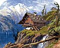
Using the same colours as Foster, Evans ground the inks for the prints in The Poems of Oliver Goldsmith, published in 1859.
-
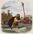
Evans used as many as ten colour blocks for the prints in A Chronicle of England, illustrated by James Doyle, and printed in 1864.
-
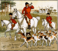
Caldecott's illustrations in The Fox Jumps Over the Parson's Gate (1883) show the subtle blend of colours Evans achieved with only a few colour blocks.
-
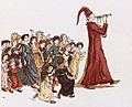
The Pied Piper of Hamelin (1888) shows subtle colour squashing on the piper's robe. It also shows the use of cross hatchings to blend colours, which are typical of chromoxylography.


More Details from John Gilpin
-
Picture from The Diverting History of John Gilpin.
-

A close-up showing vertical hatchings, different ink colours, and stippling.


